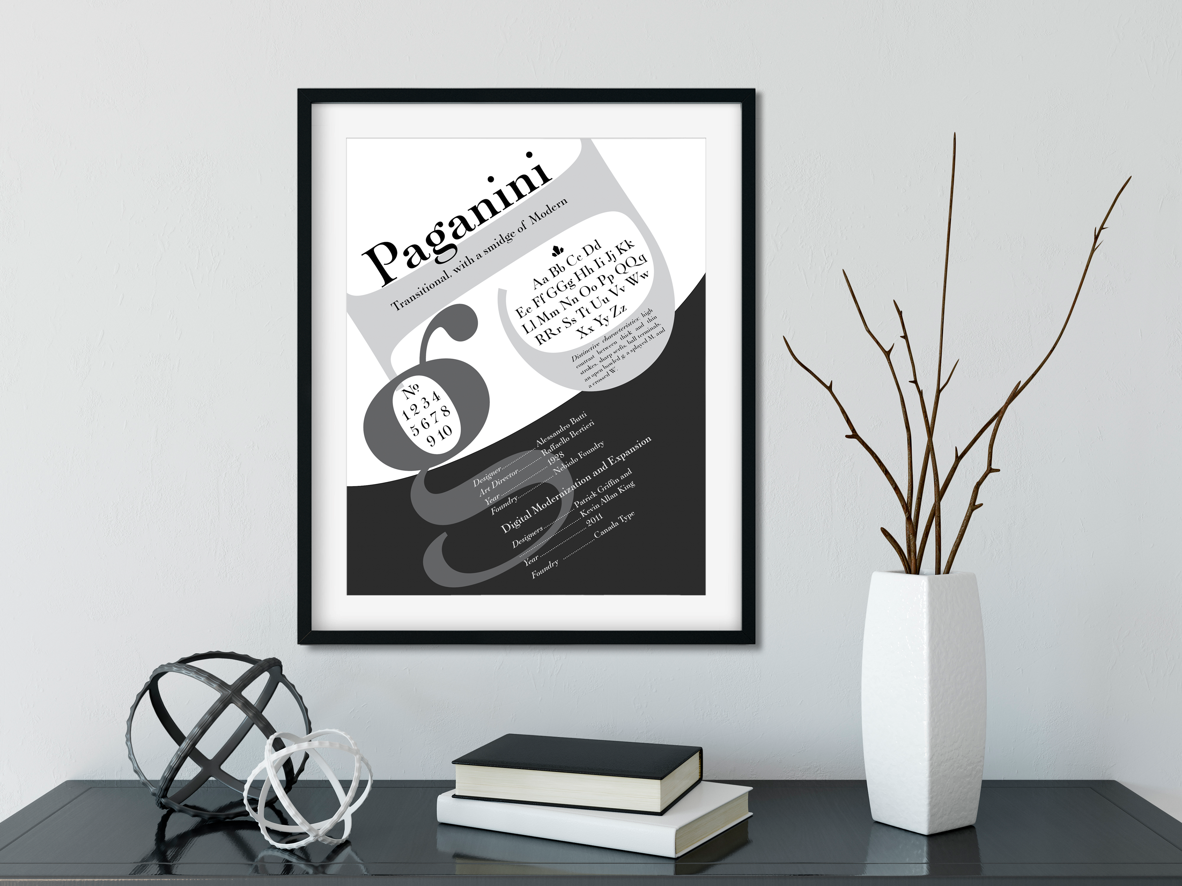
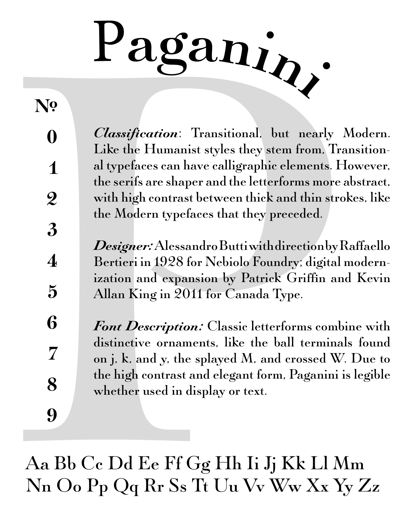
Paganini Type Classification Poster
School Project at UMUC, GRCO 230 Typography and Layout, Autumn 2015
Mission: Research a typeface and create a poster that represents the history and meaning of the font.
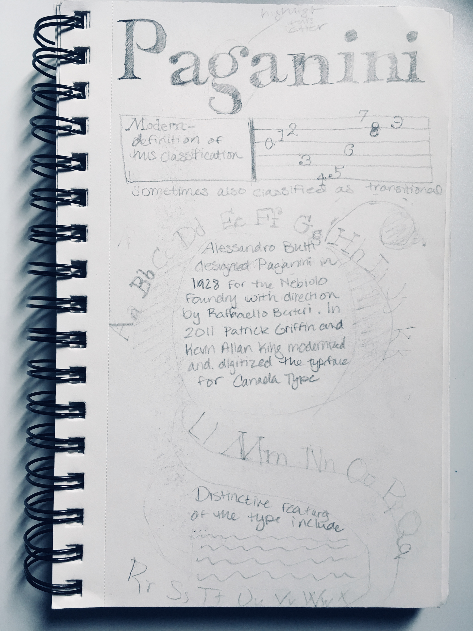
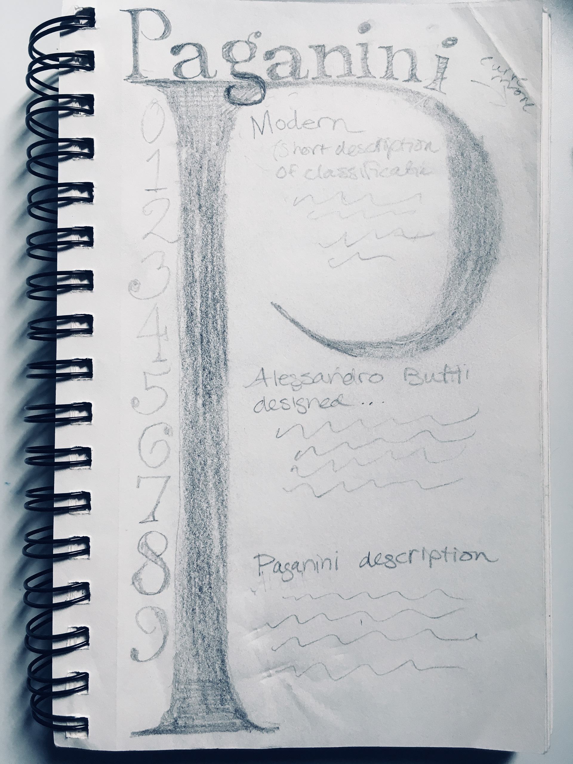
I started with sketches for two possibilities. Because there is also a Paganini in music, I thought to incorporate that into one of the designs. I also wanted to highlight the numbers as they have a very distinctive look.
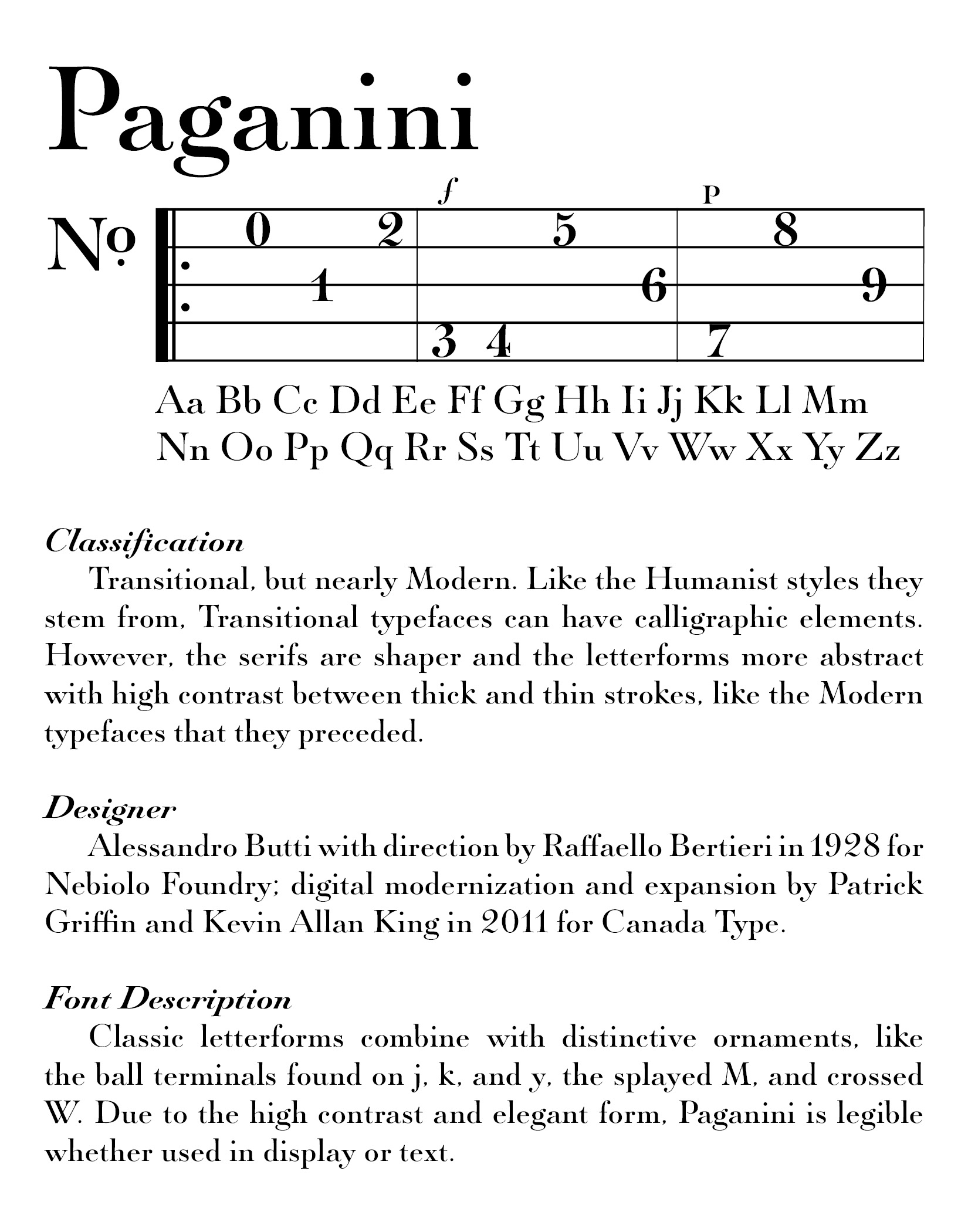
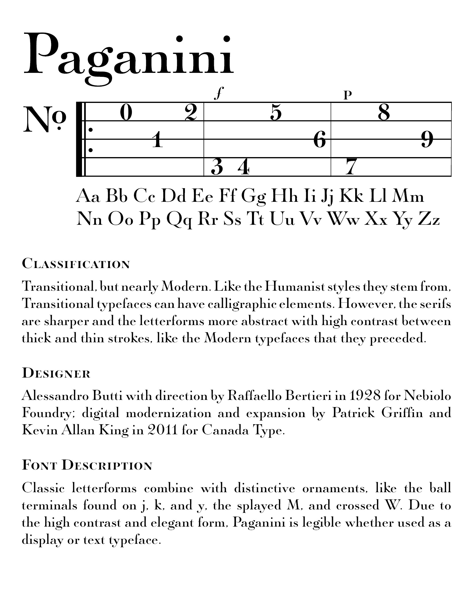
These are the first three iterations. I decided to scrap the first one and go for the second. After receiving feedback from classmates, I changed the heading and paragraph styles. My professor requested more movement and depth, so I returned to the drawing board.
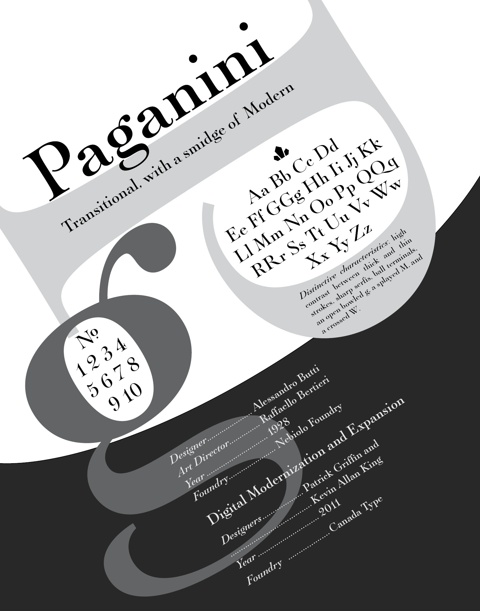
Final iteration, heavily influenced by designers working with a diagonal grid (like Tschichold).
Elements from the first design came back into play in the final iteration. This was the first project that underscored the fact that designers aren't designing for themselves-- they must please the audience.