
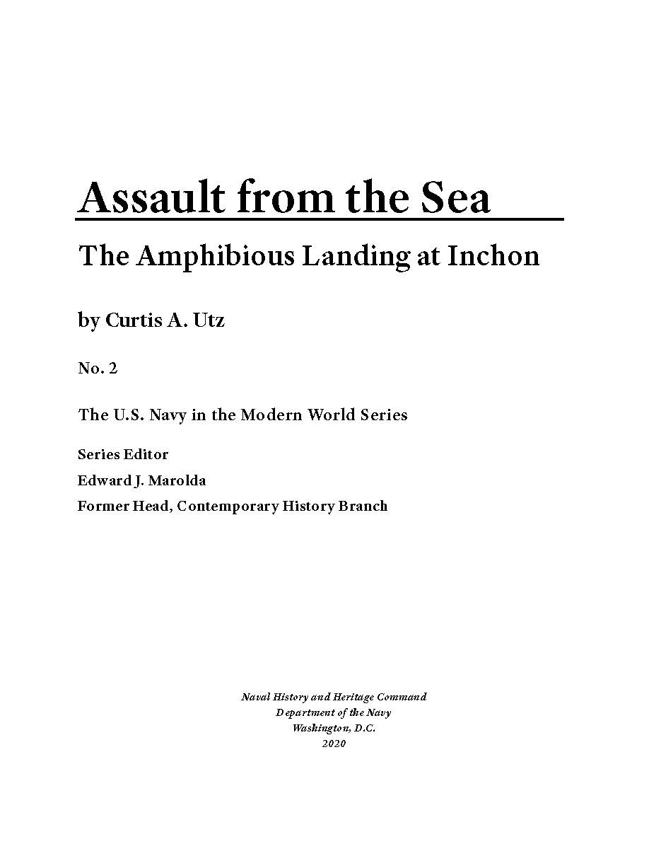
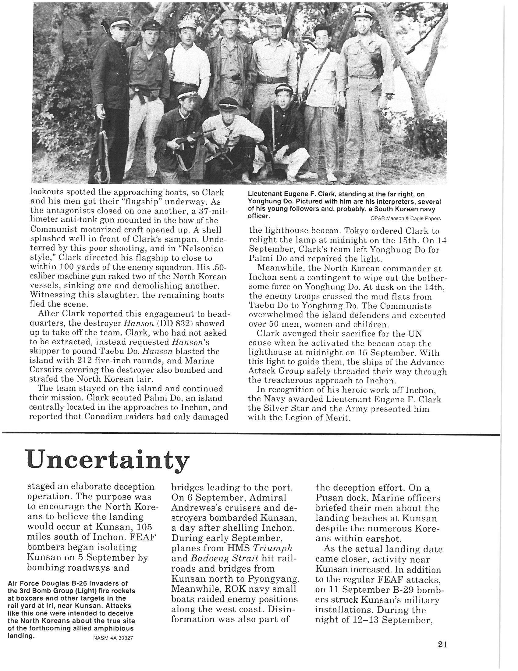
One of my major projects this year has been to digitize my organization's back catalog of publications. With the first series we tackled, there were a number of considerations: how faithful did we want to be to the original, design-wise? Were there updates or edits the author wanted to provide? One aspect we were all certain about from the beginning was the need to update the cover and brand it with our colors and updated logo.

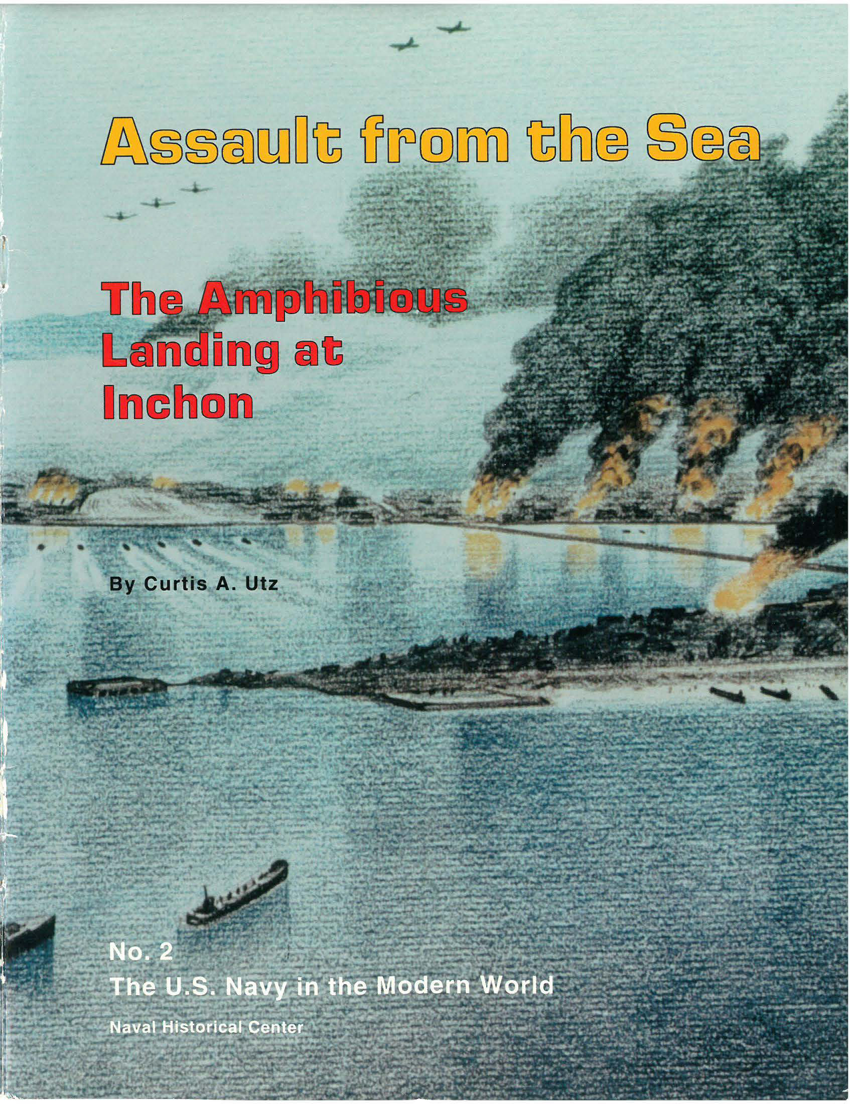
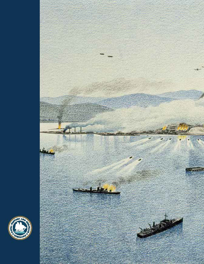
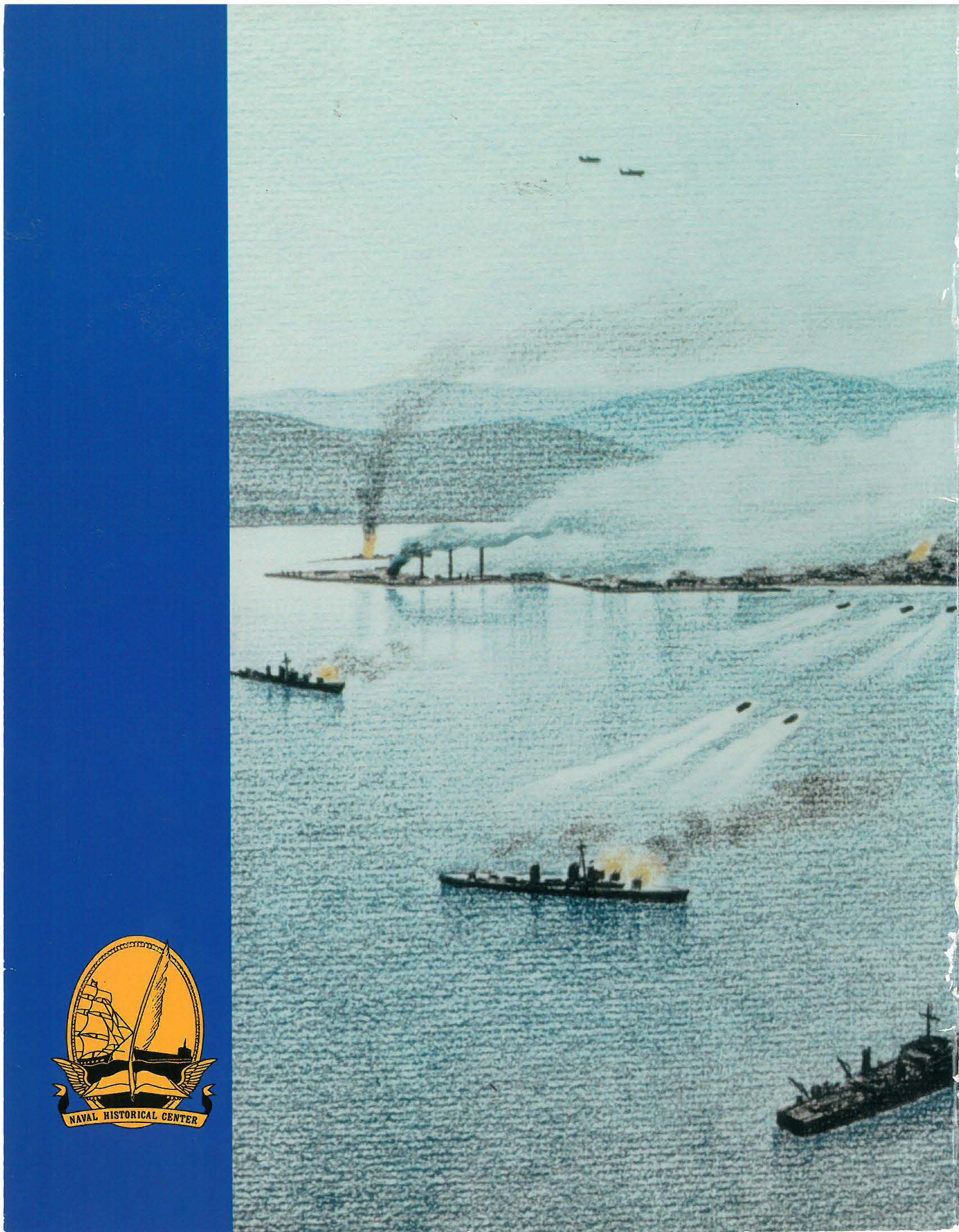
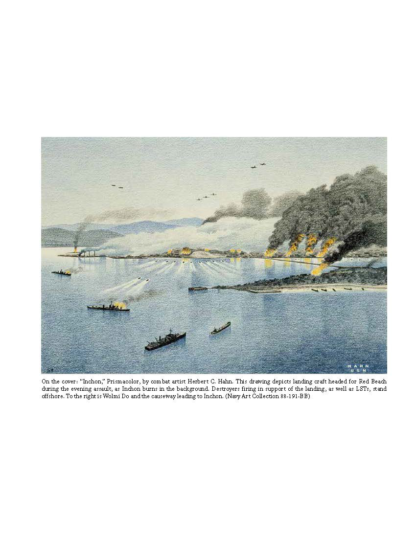
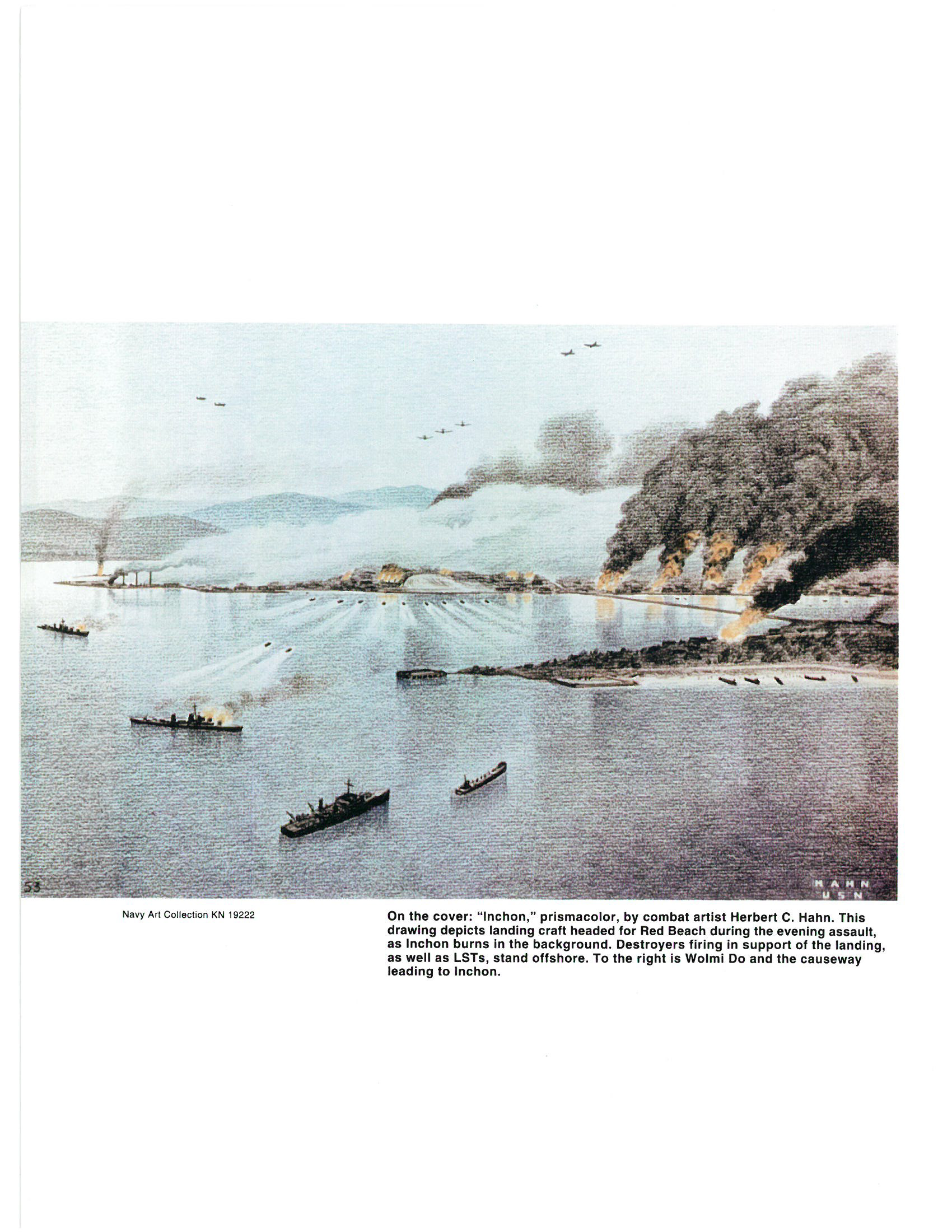
Assault from the Sea front and back covers.
The original is on the right, and the updated version is on the left.
The original is on the right, and the updated version is on the left.
The text layout also posed questions. We were in agreement on the need to reduce the number of columns from the current three, but should we go to two or one? The single column layout had the consensus, but I kept the vignettes at two columns to better distinguish them from the main text.
Some of the changes were minor, and consisted of margin adjustments, higher resolution images, and caption styles. Others, like the typeface and columns, had implications for photo placement and text flow.
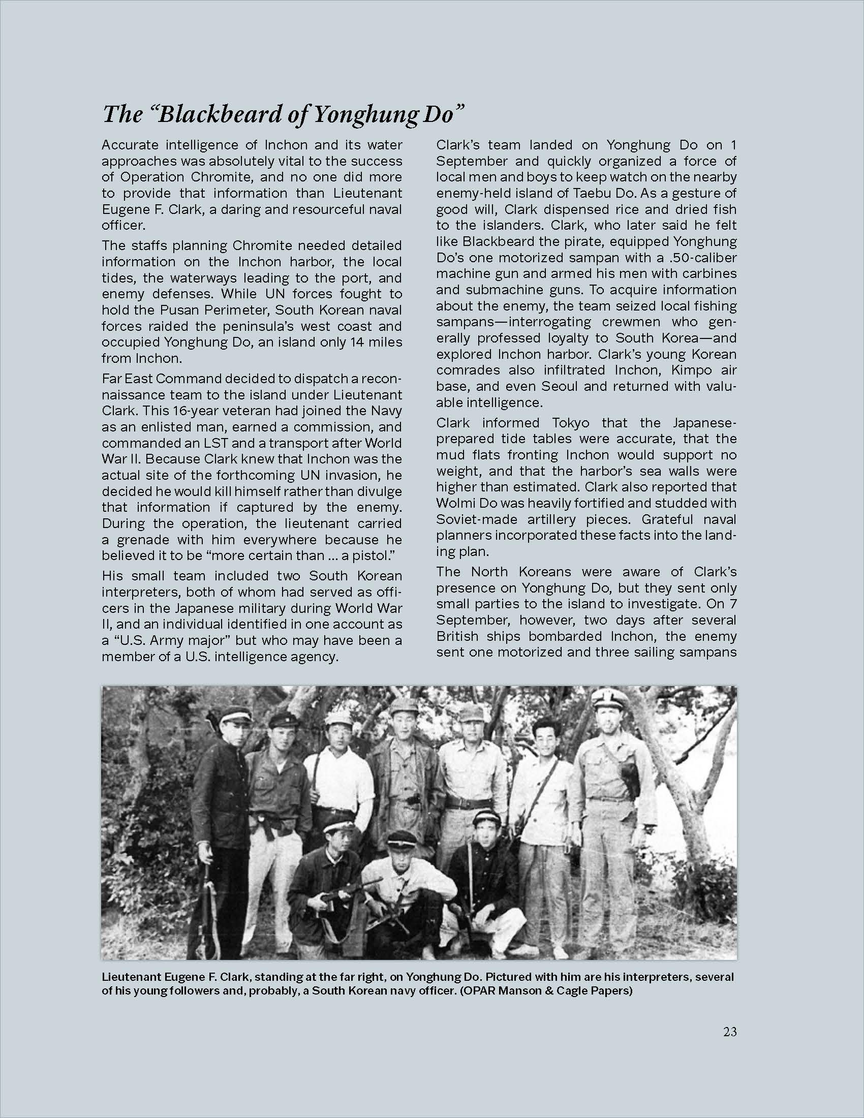
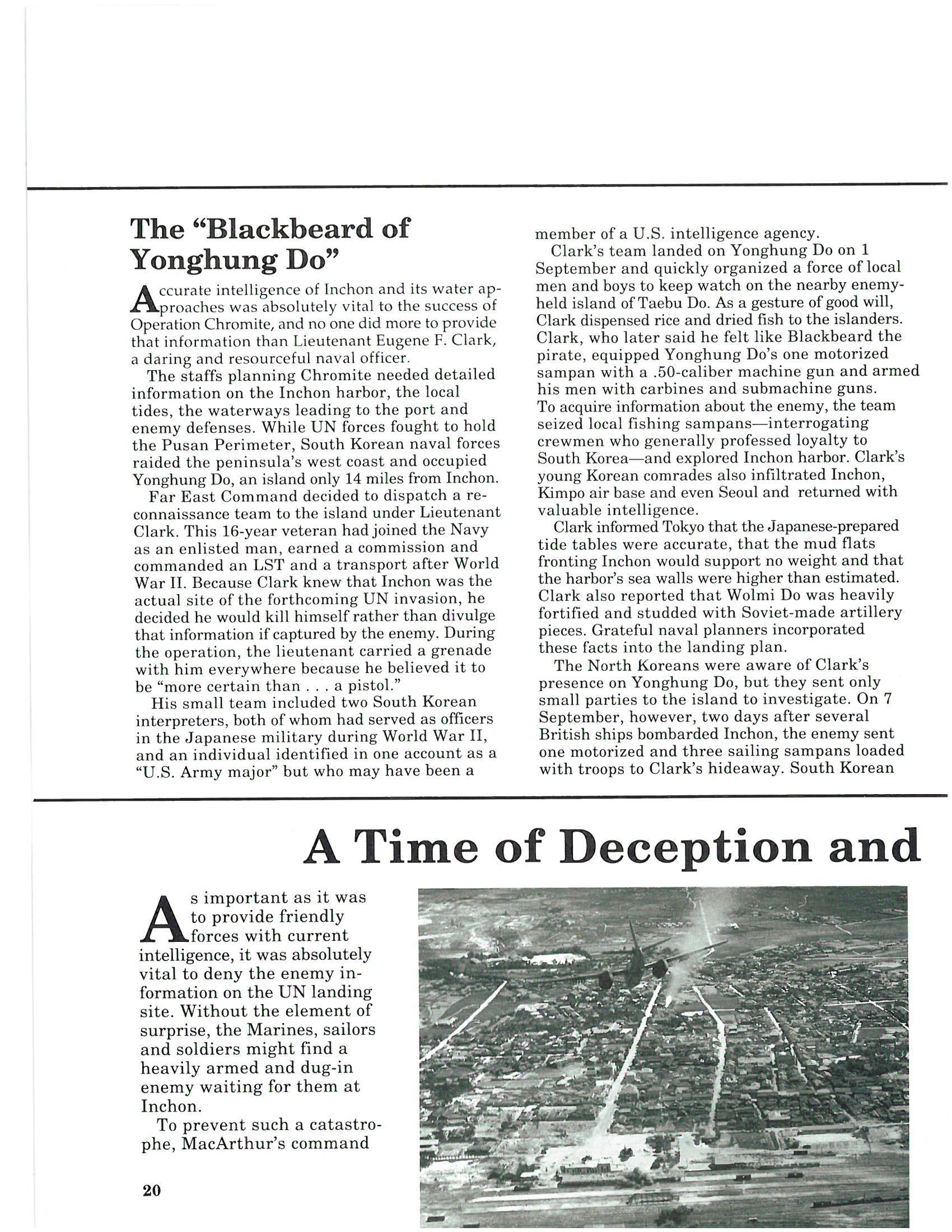

Interior layout comparison
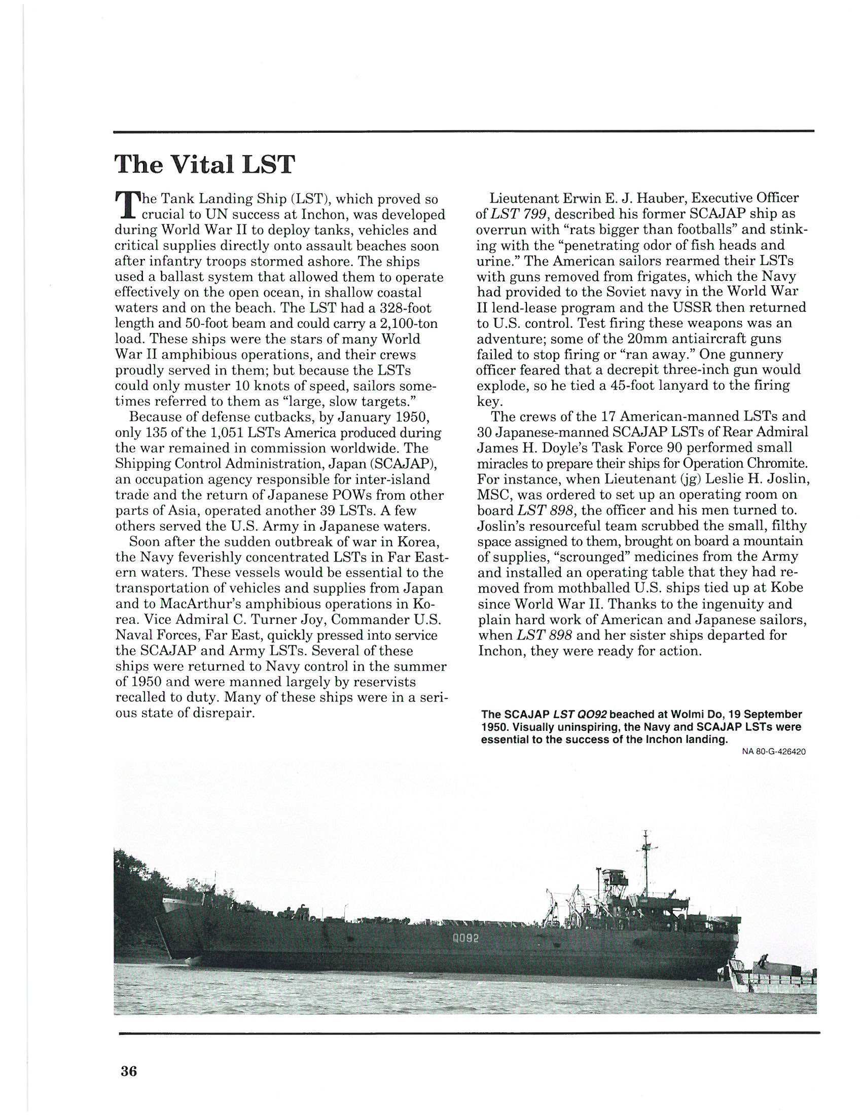
Although the vignettes share a two column layout, I chose a different approach to differentiating this content from the main text. Because the new version would be digital only, color could be used more freely.
This has been a satisfying project, and I look forward to continuing these legacy books.